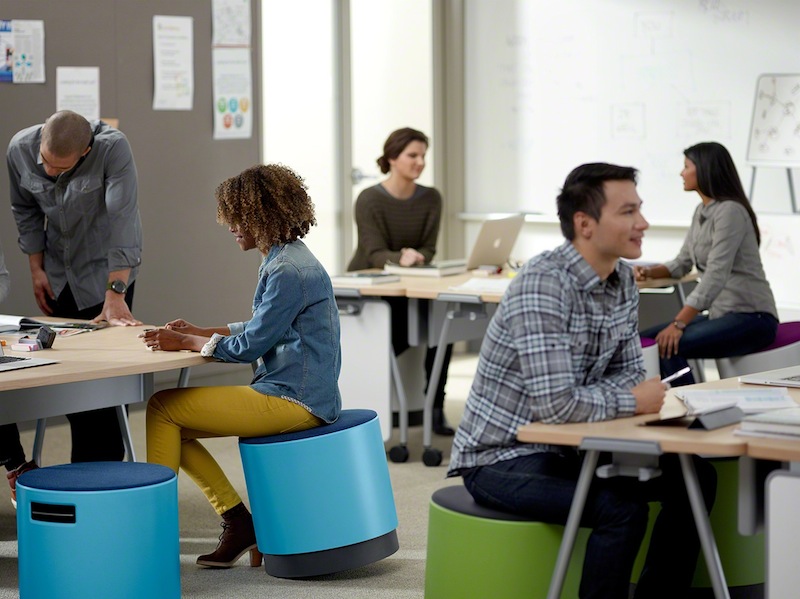
We're excited to welcome Buoy into the turnstone family as our newest product!
Buoy was designed to be as active as you are. We've heard the research and trends of how sitting all day isn't the best thing for us – so we designed Buoy to allow you to move, swivel, turn, and tilt.
We also love color and personalization. Buoy is available in 6 different colors with a myriad of different padded caps to add cushion, pattern, and style to your Buoy.

As with all new products, there is an awesome team behind the product. We took a moment to hear the design process of Buoy from one of our designers, Ricky Biddle. In typical Ricky style, he first came up with a haiku to introduce you to Buoy.
seating made simple
movement yields focus at work
activity is good
What inspired you throughout the designing process?
Over the past few years we’ve observed multiple trends emerging around the relationships of movement and work. We became particularly interested in the confluence of the ideas of physical activity helping to improve mental activity and the health benefits of even small amounts of movement throughout the day. While these ideas could be applied fairly broadly, they seemed to be a particularly good fit for the dynamic world that is small business making it fertile ground for turnstone to explore.
When we began our exploration, we wanted to find a simple seating solution that would allow for movement and work in multiple environments and applications. turnstone had explored some initial ideas around active seating with a rocking stool concept called Humma shared at Neocon a few years ago, but for Buoy we wanted to allow a greater freedom of movement and a create a highly functioning product that could complement multiple settings and work with different height tables and related items around the home and office from both a functional and aesthetic point of view .
It's really very easy – Buoy is inspired by simplicity, fun, and movement. These are three trends we're seeing the in the workplace and that we integrated into Buoy.
Who is Buoy designed for?
Active seating for active people in traditionally sedentary environments (offices). Research shows that even people who typically work out after work don't receive the same benefit if they are sitting all day. Overall, we recognize that movement is good so any way we can bring movement to the office is something we look for.
Tell me about the Buoy design in depth.
At a glance, Buoy is comprised primarily of a large cylinder with a contrasting padded top. Tucked within a slim pocket on the side, there is a lever that enables he cylinder to raise up to five and a half inches revealing a smaller contrasting cylinder beneath it that appears to float ever so slightly off the floor.
Buoy sits at a slight angle suggesting the movement you experience as you take a seat and buoy rocks in all directions from a central point. The slim cap on the top of the cylinder serves as a subtle cushion working with the shape of the cylinder underneath to give a comfortable, but responsive surface to allow for maximum movement and response. The cap is also available in various fabrics to allow users to make a more personalized Buoy.
Some of the first buoy prototype were built by adding movement and height adjustability to the existing Campfire Ottoman. In doing this we realized the general feel and experience of a domed bottom to allow for rocking in all directions was pretty appealing, but wanted to scale it more appropriately to the size of the user and make it easier to move around and stow away. We felt it was important for our solution to live in many places: lounges, desking, homes, and more. We also felt it could function as primary seat in some instances and guest seating in others, working on it’s own and in multiples and wanted to ensure the design took all this into consideration.
Many of the early prototypes were fully upholstered, which made even the baseline product more expensive which wasn't appropriate for all customers and applications. So, we began looking at other ways to address comfort and personalization being very deliberate about where and how our solutions impacted the user experience and their effect on the cost. From the beginning, we envisioned a simple solution, and we definitely felt the truth of the old design adage “simple is hard” as we worked to keep it that way throughout the design and development process.
We're excited to see where and how people will use their Buoy: home, office, play, or even at the gym.
How would you use a Buoy?
